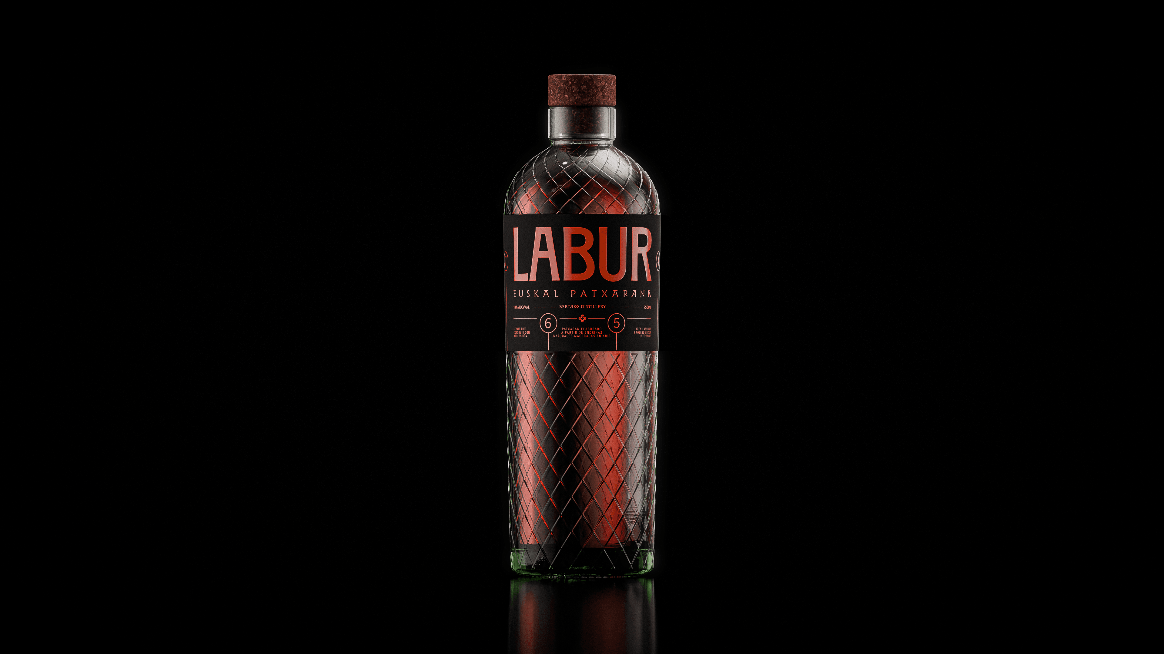
Labur - Basque Patxaran

Pacharán is a drink deeply connected to Basque culture, yet its current visual identity is largely defined by very traditional design codes. Across the category, these aesthetics have remained almost unchanged for decades, causing the product to feel distant or unappealing to younger audiences and strongly tied to a specific generation. Based on this observation, the aim of the project was to rethink how pacharán could be presented through a contemporary lens, without losing its cultural roots or local character. Rather than redesigning an existing brand, the project explores a conceptual approach that demonstrates how pacharán could connect with a broader and more modern audience. The starting point of the project is the name Labur, a term from Basque pelota used to describe a short serve that fails to reach the required distance. It is a simple, familiar word within Basque culture, providing a strong and authentic foundation for the brand identity. From this concept, the packaging design takes direct inspiration from the frontón, particularly elements such as wall numbering and spatial geometry. These references are translated into a cleaner, more direct, and contemporary visual language, moving away from the traditional graphic codes commonly found in the category. The proposed solution seeks to balance tradition and modernity, preserving the local essence of the product while presenting it in a more accessible, fresh, and relevant way. Labur offers a new perspective on pacharán, one that respects its origins while adapting to the visual and cultural expectations of new generations.


