Case Study

Discover
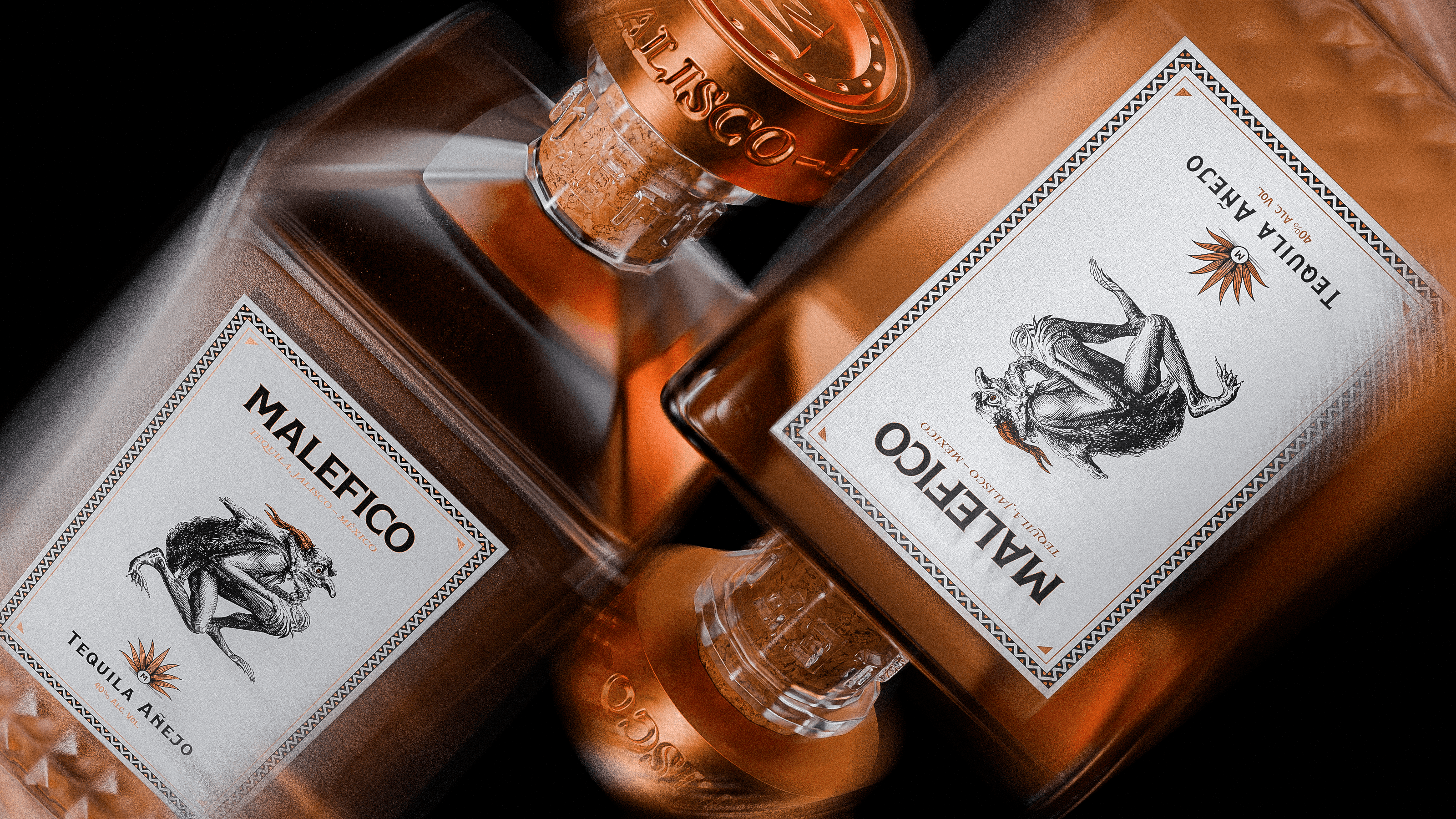
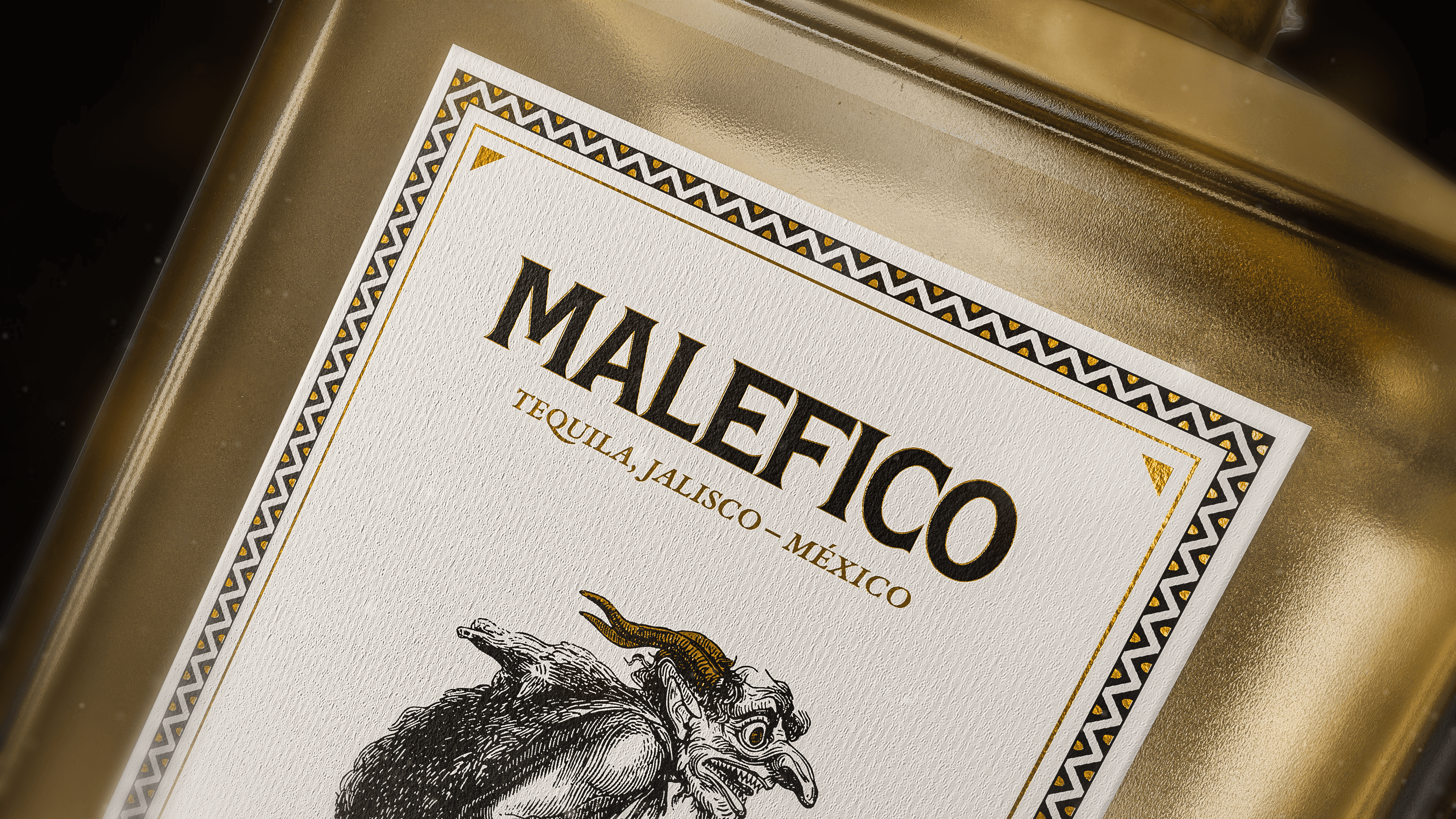
A Darker Expression of Tequila Culture
Maléfico Tequila explores a darker and more mysterious interpretation of traditional tequila branding. Inspired by folklore, ritual, and the symbolic imagery often associated with Mexican mythology, the project aimed to create a tequila brand with a strong and distinctive personality. The challenge was to design a packaging system that felt bold and memorable while still respecting the heritage and craft of tequila production. Through expressive typography, symbolic elements, and dramatic visual contrasts, the identity was designed to capture attention and create a striking presence both on shelf and online.
Client
Malefico Tequila
Industry
Spirits / Tequila
Year
2025
Services
Brand Identity, Packaging Design, Label Design, 3D Visualization


Concept
Concept & Visual Language
The visual identity for Maléfico centers around the idea of temptation, myth, and ritual. The name itself suggests something forbidden or supernatural, which informed the tone of the entire brand.
Typography was developed to feel bold and slightly ominous, while graphic elements draw inspiration from traditional Mexican symbolism and folklore. The goal was to balance cultural reference with a contemporary and premium aesthetic.
The resulting packaging uses strong contrast, expressive details, and a carefully structured label composition to create a tequila brand that feels distinctive, confident, and memorable.
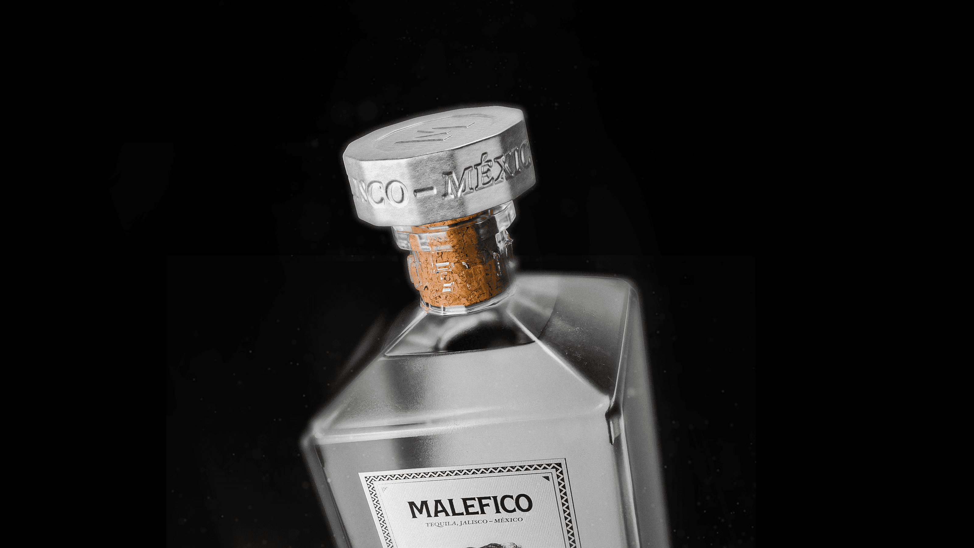
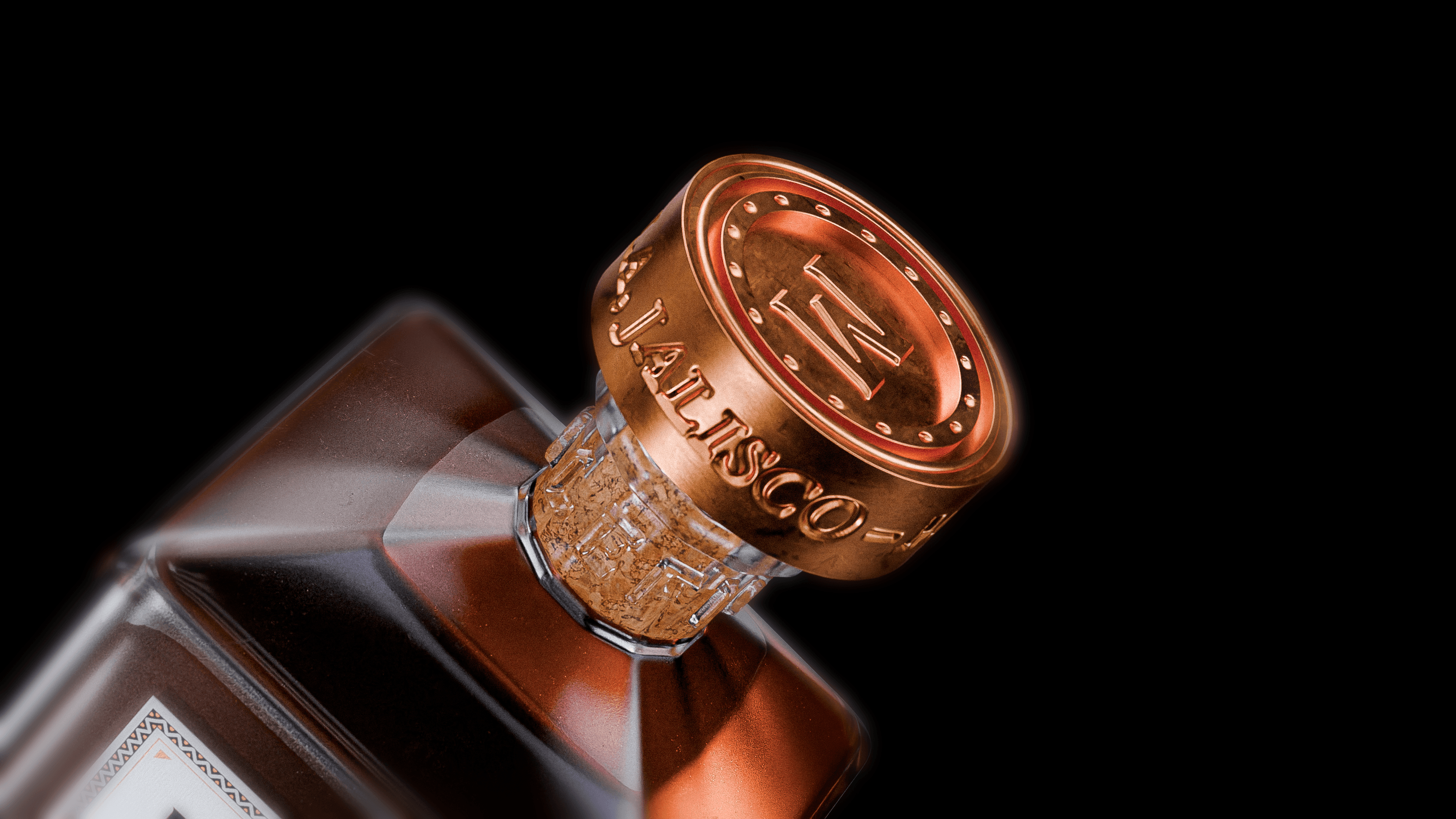
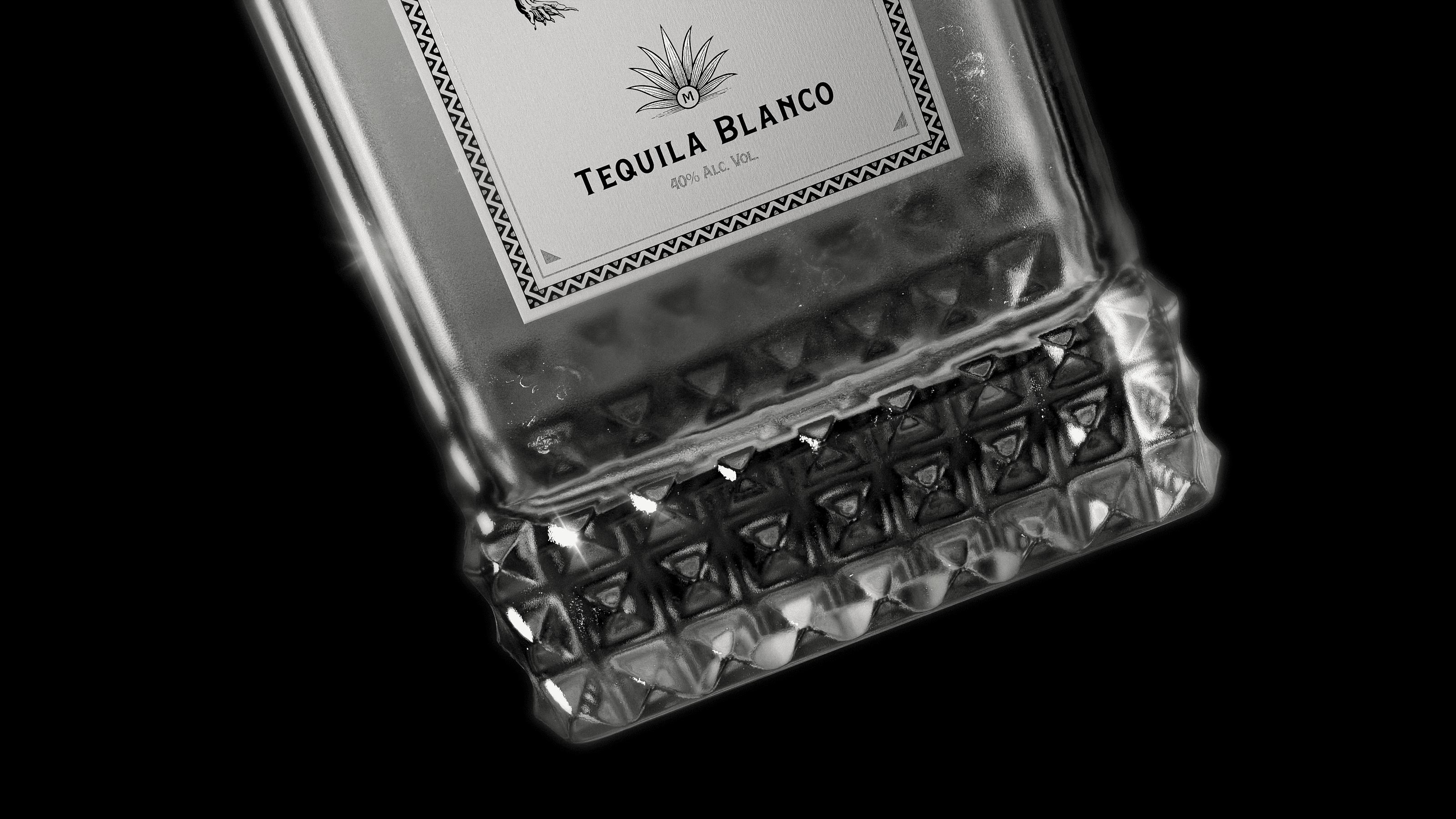
Packaging Design
Designing a Striking Shelf Presence
The final packaging emphasizes visual impact while maintaining clarity and balance. The label composition and material finishes were carefully developed to ensure the bottle commands attention without losing its premium character.
Through strong typography, dramatic contrast, and symbolic graphic elements, the design creates a distinctive tequila brand that stands apart within the spirits category.
The result is a bold identity that communicates mystery, craft, and confidence.