Spirits Packaging
How to Stand Out on the Shelf Without Looking Cheap
Standing out on the shelf is not about being louder, it’s about being clearer, more intentional, and instantly recognisable. This article explores how premium brands create impact in seconds without sacrificing perception.

Shelf presence is designed, not decorated
Most packaging does not fail because it lacks effort. It fails because it confuses impact with addition.
When a brand wants to stand out, the instinct is often to add more, more graphics, more color, more messaging, more visual signals competing for attention. But shelf presence rarely comes from accumulation. It comes from control.
A product does not stand out because it is overloaded with detail. It stands out because the design has been structured to read quickly, clearly, and confidently in a crowded environment.
That is the difference between something that feels designed and something that feels decorated. Decoration is applied on top. Presence is built into the object from the start.
Shelf impact is decided in seconds
On shelf, nobody begins with analysis. People scan first and interpret later.
That first impression happens before the product is touched, before the copy is read, and often before the brand name is fully processed. What registers first is shape, proportion, contrast, silhouette, and hierarchy.
That is why shelf impact is decided in seconds.
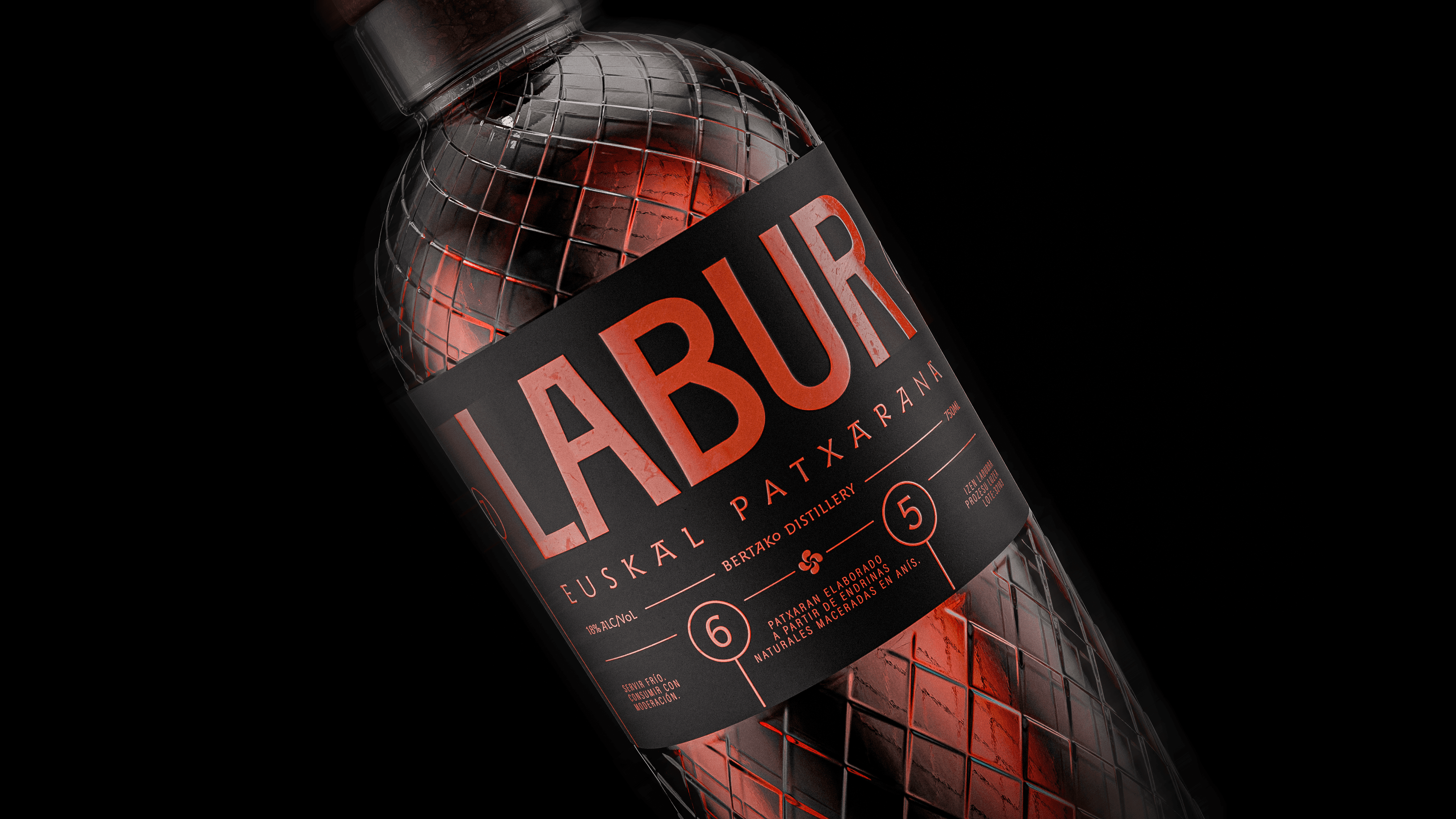
A bottle like Labur, for example, does not rely on excessive ornament to create attention. Its presence comes from a bold proportion, a strong label block, and a direct contrast between the dark structure and the red tones underneath. The bottle feels immediate because the main read is immediate.
The same principle applies across categories. Shelf impact is less about how much the design says and more about how quickly it says the right thing.
Clarity beats complexity every time
One of the most common mistakes in packaging is assuming that more information or more visual richness automatically creates more value.
Usually, the opposite happens.
When too many elements compete for attention, the design stops communicating as a whole. It starts fragmenting. The eye does not know where to land, the hierarchy weakens, and the brand loses force.
Strong packaging edits.
It creates one dominant read and lets the rest support it. In Labur, the oversized wordmark does much of the heavy lifting. The structure is clear, the contrast is sharp, and the design does not need to shout in ten different directions to be visible.
Clarity is not a minimal style choice. It is a performance advantage.
A strong identity works from distance and up close
Good packaging has to work in two stages.
From a distance, it needs to create recognition. Up close, it needs to reward attention.
That second layer is where materials, finishing, illustration, typography, texture, and detail begin to matter more. But those details only work properly when the first read is already strong.
This is what makes projects like Tres Torres interesting in the context of shelf presence. From far away, the structure remains composed and recognisable. Up close, the identity expands through illustration, gold details, paper texture, and narrative cues embedded into the label and tube.
The same idea applies to the close-up views of the pack. The viewer begins to notice the embossed details, the tower illustration, the floral and animal elements, the material richness, and the precision of the print surface. None of this replaces clarity. It reinforces it.
That is what strong shelf design does. It captures attention at distance and deepens perception up close.

Standing out is not the same as being loud
A lot of packaging tries to win attention by becoming more aggressive. Brighter, busier, more decorated, more explicit.
But strong shelf presence does not always look louder. Often, it looks calmer.
The products that feel most confident are usually the ones with the clearest visual discipline. They understand what deserves emphasis and what should stay quiet.
That restraint is what keeps a design from feeling cheap. Because once every element is trying to perform at maximum volume, the result stops feeling premium and starts feeling insecure.
Standing out does not mean abandoning control. It means using control more intelligently.
A range should feel like one idea, expressed clearly
Shelf presence becomes even more important when packaging is not seen as one isolated product, but as part of a broader brand world.
A strong product should work alone. A strong brand should work repeatedly.
This is why the more atmospheric and repeated views of the Tres Torres range matter as much as the single hero shot. When several packs appear together, the consistency becomes part of the impact. The brand begins to feel less like a one-off design and more like a world with its own internal logic.
That same principle applies whether the product is illustrative and story-led or typographic and stripped back. Visibility on shelf is not only about the single front label. It is also about whether the brand can hold its presence across multiple views, multiple products, and multiple moments of recognition.
What actually makes a product stand out
In practical terms, shelf presence usually comes from a combination of a few core decisions:
a clear focal point
strong contrast
immediate hierarchy
disciplined restraint
recognisable shape or silhouette
detail that supports the main read rather than distracting from it
These are simple principles, but they are what separate packaging that performs from packaging that merely looks busy.
The strongest designs do not try to impress through excess. They build authority through precision.
Conclusion
To stand out on shelf, a product does not need more decoration. It needs more clarity.
It needs to be readable in seconds, recognisable at distance, and convincing up close. It needs to hold attention without forcing it. And above all, it needs to feel intentional.
That is why shelf presence is designed, not decorated.
The brands that stand out best are not the ones adding the most. They are the ones removing what is unnecessary, controlling what remains, and building an identity strong enough to work in the real world—on shelf, under pressure, beside everything else.