Spirits Packaging
What Makes Premium Spirits Packaging Feel Truly Premium?
A closer look at the design decisions that make spirits packaging feel elevated, from typography and materials to structure and storytelling.
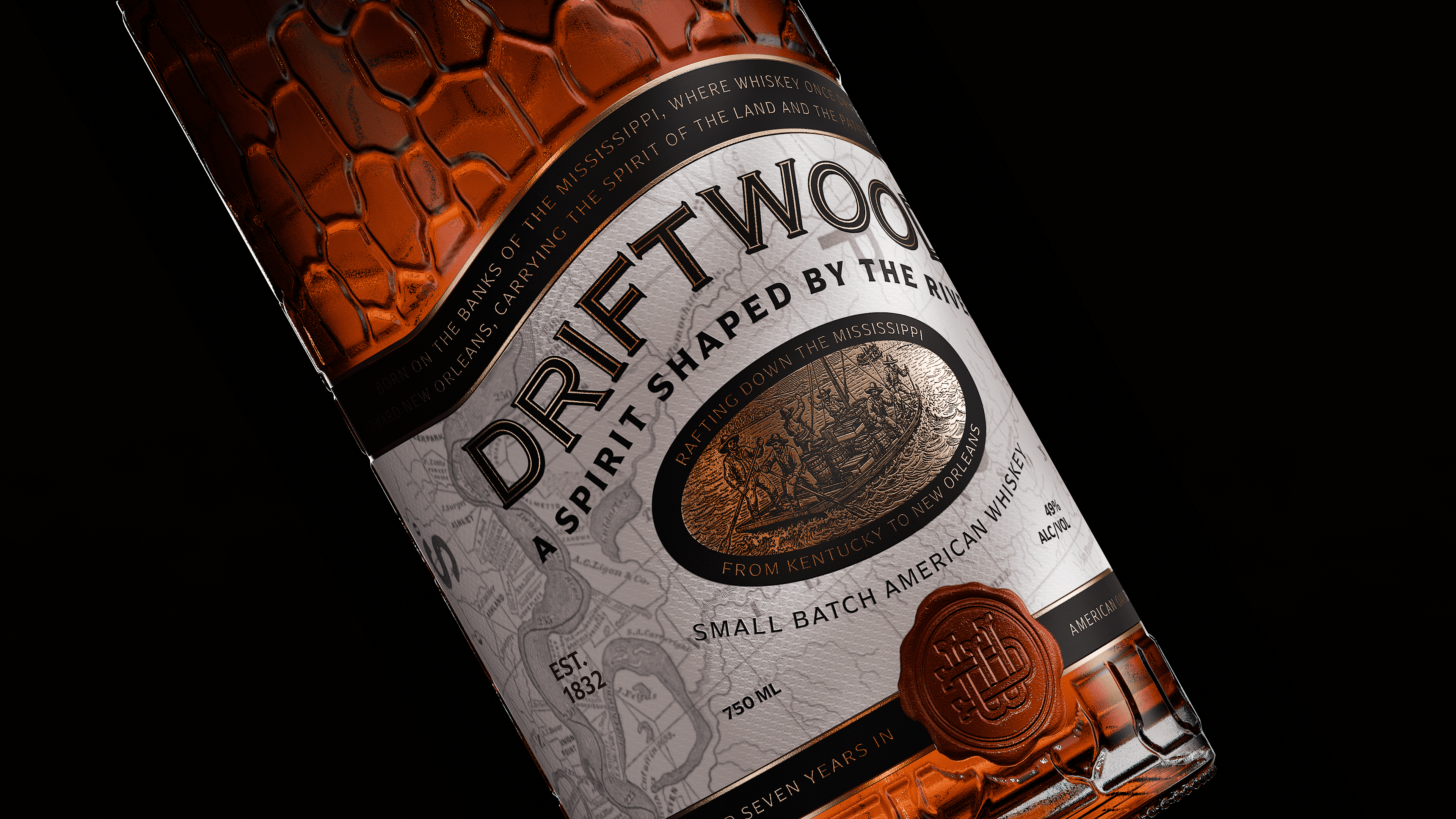
Premium is something you feel before you read
Premium perception happens instantly.
Before the label is read, before the story is understood, the object already communicates something. The weight of the bottle, the balance of the composition, the contrast between elements, and the quality of materials all shape that first impression.
This is where many brands fail. They rely too heavily on messaging, assuming that value will be understood once the product is explained.
But premium is not explained. It is perceived.
If the packaging only communicates quality after being read, it has already lost its advantage.
Difference is controlled, not accidental
Premium brands are defined by precision.
Every decision feels intentional. Typography, spacing, proportions, and materials all follow a clear logic. Nothing appears arbitrary, and nothing feels out of place.
This level of control creates clarity. It makes the brand feel confident, stable, and recognizable.
In contrast, when decisions are made without structure, the result may still look “good,” but it lacks cohesion. The design feels assembled rather than built.
Premium is not about making things look different. It is about controlling how that difference is created.
Premium is not added. It’s built into the system
One of the most common mistakes is treating premium as an extra layer.
Foil, embossing, textured paper—these are often introduced at the end of the process, as if they can elevate the design on their own.
But without a strong foundation, these elements feel decorative rather than meaningful.
Premium is not something you apply. It is something you define from the beginning.
It comes from how the brand is structured, how it behaves across products, and how consistently it applies its own rules.
Premium starts with restraint, not decoration
There is a tendency to associate premium with complexity.
More detail, more elements, more visual information. But in practice, this often leads to the opposite effect.
Over-designed packaging feels uncertain. It tries to communicate too much, and in doing so, it loses clarity.
Restraint creates confidence. It allows key elements to stand out, and gives the design a sense of control.
Premium brands are not louder. They are more precise.
Premium is built into the object, not applied on top
Packaging is not just the label.
The bottle, the closure, the proportions, and the physical presence of the object all contribute to how the brand is perceived.
When these elements are considered from the start, the result feels cohesive. The packaging becomes an object with presence, not just a surface with graphics.
When they are treated as secondary, the design relies too heavily on visual tricks to create impact.
Premium is not a layer. It is a construction.
Material and finish create depth without adding noise
Materials are often misunderstood as decoration.
In reality, they are tools to reinforce the system.
A subtle texture, a controlled emboss, or a restrained use of foil can create depth and richness without overwhelming the design.
The goal is not to add more, but to enhance what already exists.
When materials are aligned with the structure, they elevate perception. When they are not, they become noise.
Conclusion
Premium packaging is not defined by isolated decisions.
It is the result of control, structure, and restraint applied consistently across every element.
That is why some brands feel instantly elevated, while others—despite using the same materials and finishes—feel generic.
The difference is not in what is used.
It is in how it is built.