Case Study

Max & Bella - Petfood Packaging System

Max & Bella - Petfood Packaging System

Discover

Designing a packaging system that feels playful, clear, and shelf-ready

Max & Bella is a Miami-based pet food brand developed to stand out in a highly competitive and visually saturated category. The objective was to create a packaging system that felt approachable, distinctive, and easy to navigate across different products. The challenge was to balance personality and clarity, building a visual language that could give the brand a stronger shelf presence while remaining functional and scalable for future extensions. During the discovery phase, the focus was placed on understanding the category landscape, identifying visual opportunities, and defining a direction that could connect with pet owners through a more expressive yet structured identity.

Client

Max & Bella

Industry

Pet Food

Year

2025

Services

Brand Identity, Packaging Design & Visual System

Overview

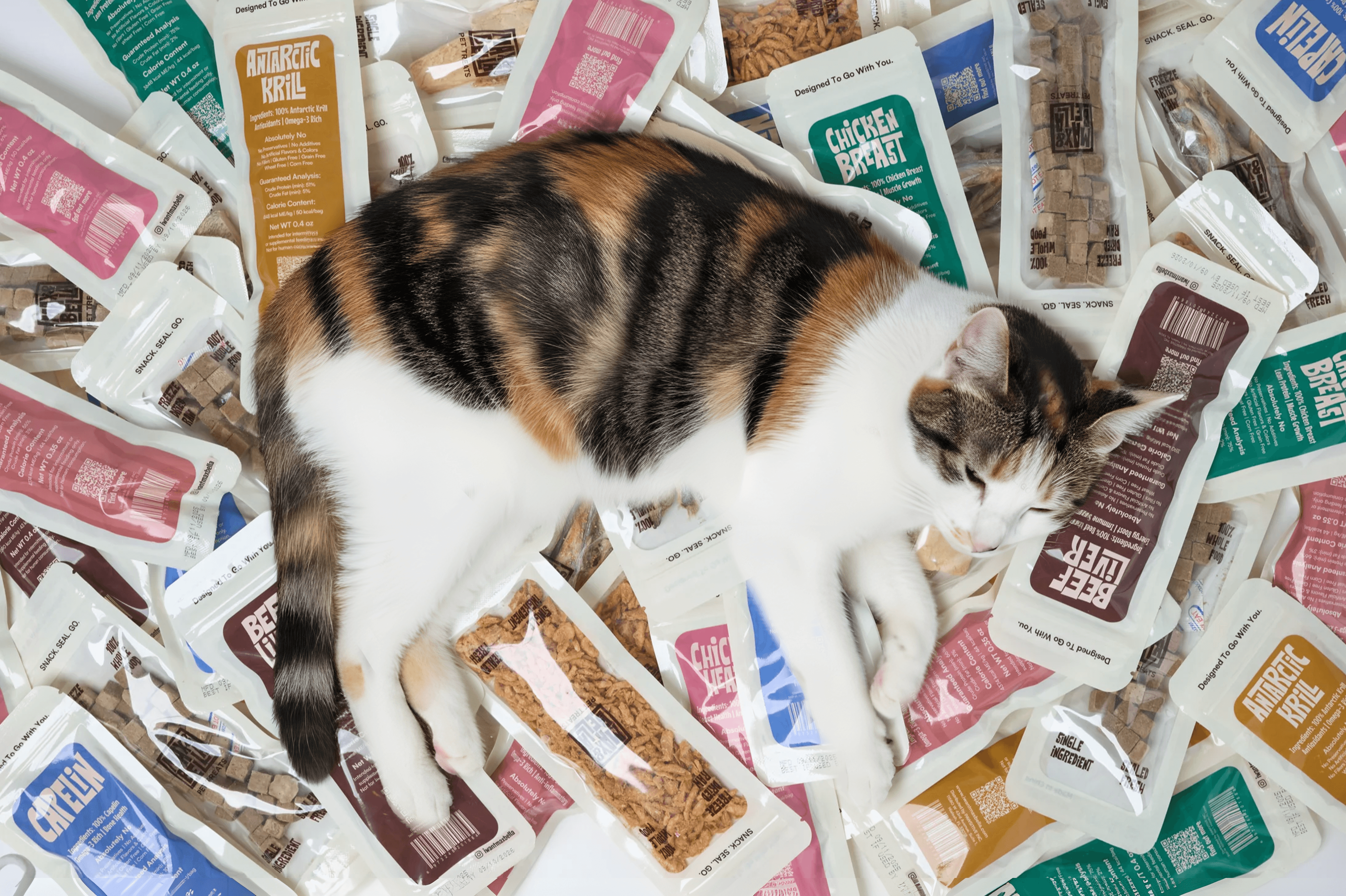
Max & Bella is a Miami-based pet food brand created to bring a more expressive and contemporary approach to the category. The project focused on developing a packaging system that feels distinctive on shelf while remaining clear, functional, and easy to expand across multiple products.

The goal was to move away from generic pet food aesthetics and build a brand that connects emotionally with pet owners through color, typography, and a more playful visual language.

Design Approach

The design system was built around a combination of bold color, structured layouts, and expressive label compositions. Each product is clearly differentiated while maintaining a cohesive identity across the range.

Typography plays a central role in the system, helping to balance playfulness with clarity. The labels were designed to be visually engaging from a distance while remaining easy to read and navigate at a closer level.

The result is a packaging system that feels both dynamic and organized, allowing the brand to grow without losing consistency.

Planning a new product or packaging project?
Let’s create something distinctive.

Planning a new product or packaging project?
Let’s create something distinctive.

Planning a new product or packaging project?
Let’s create something distinctive.