Case Study


About Project
Concept & Visual Language
The visual identity centers around the three towers that give the brand its name. These architectural elements become the foundation of the illustration and label design, symbolizing heritage, stability and craftsmanship.
Botanical elements were integrated to reference the gin’s ingredients while introducing color and richness to the composition.
Typography was carefully balanced with the illustration to create a refined yet expressive label that communicates both premium quality and storytelling.


About Project
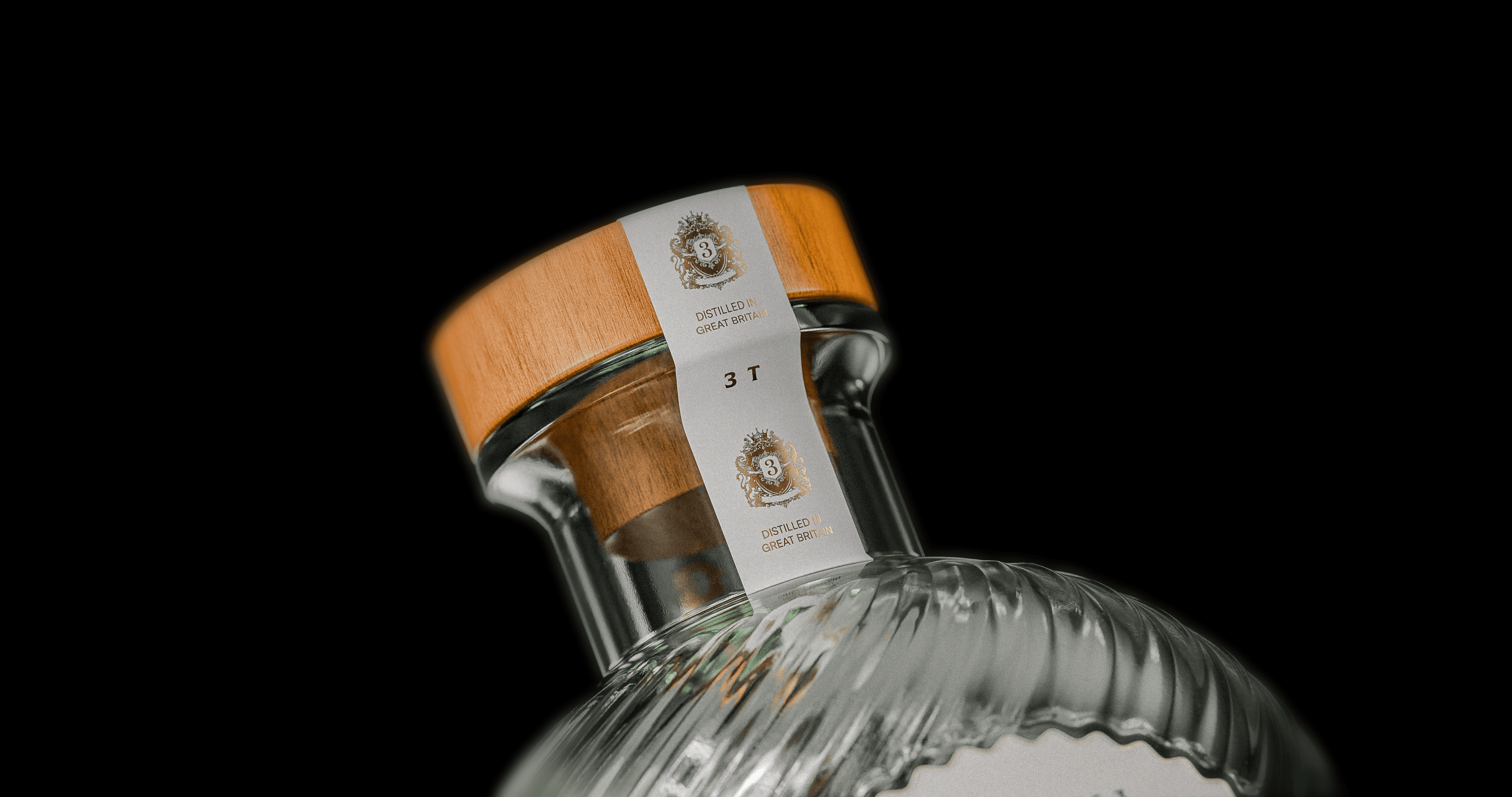
Packaging Designed to Stand Out
The final packaging combines illustration, typography and material finishes to create a distinctive presence both on shelf and online.
The bottle design enhances the label’s visual richness, while the overall composition maintains clarity and elegance.
Together, the identity and packaging establish Tres Torres as a premium spirit with a strong and memorable visual character.